When you are building a brand, your logo acts as the handshake of your business. It tells people who you are before they ever read a single paragraph on your website.
Choosing a calligraphy font—a style of lettering that mimics beautiful, flowing handwriting—is a great way to make your business feel personal, elegant, or unique.
However, picking a beautiful script for a digital logo requires a balance between artistic style and web-friendliness. A font might look lovely on a large piece of paper, but if it shrinks down into an unreadable scribble on a smartphone screen, it will drive potential clients away.
To help you choose the perfect look for your business, here is a breakdown of the best types of calligraphy fonts for logos and what they say to your audience.
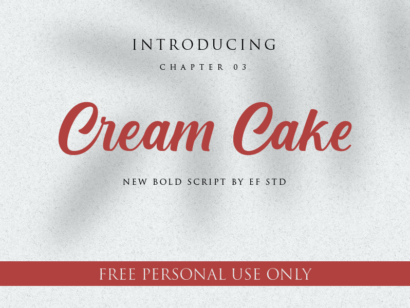
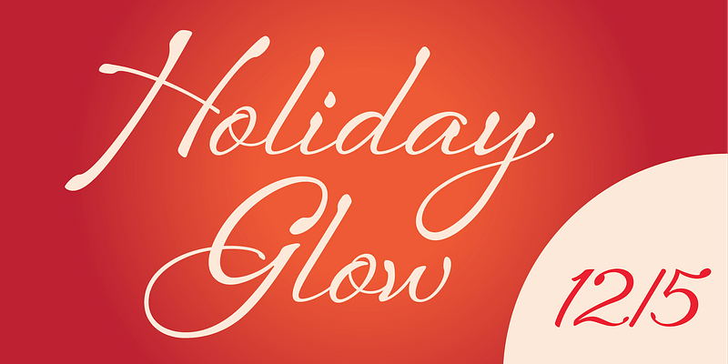
Elegant and Formal Scripts (For Luxury and Sophistication)
If your business is a high-end wedding venue, a luxury boutique, or a premium spa, you want a font that feels traditional, graceful, and expensive. Formal calligraphy fonts feature dramatic loops, sweeping flourishes, and high contrast (where the vertical lines are thick but the horizontal lines are thin).
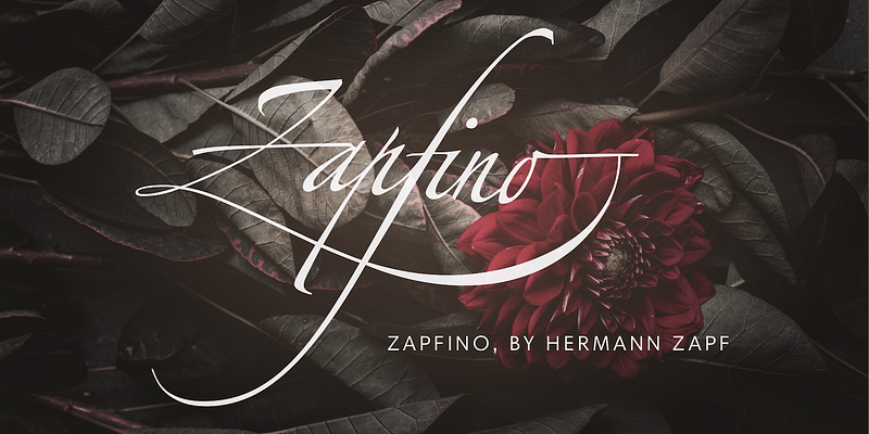
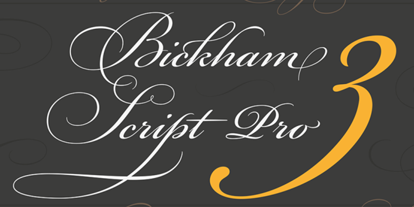
- Famous Examples: Zapfino, Great Vibes, or Bickham Script.
- The Vibe: High-end, elite, and timeless.
- Web Design Tip: Because these fonts have thin, delicate lines, they can easily get “lost” or look blurry on small screens. If you use a formal script for your logo, pair it with a very clean, simple background on your website so it stays readable.
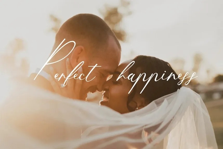
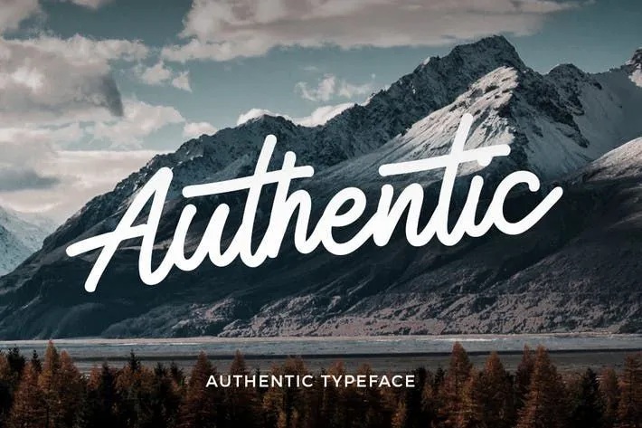
Modern Signature Fonts (For Personal Branding)
Signature fonts look exactly like someone signed their name with a high-quality fountain pen or a stylized felt-marker. They are less rigid than formal scripts and feel much more casual and personal.
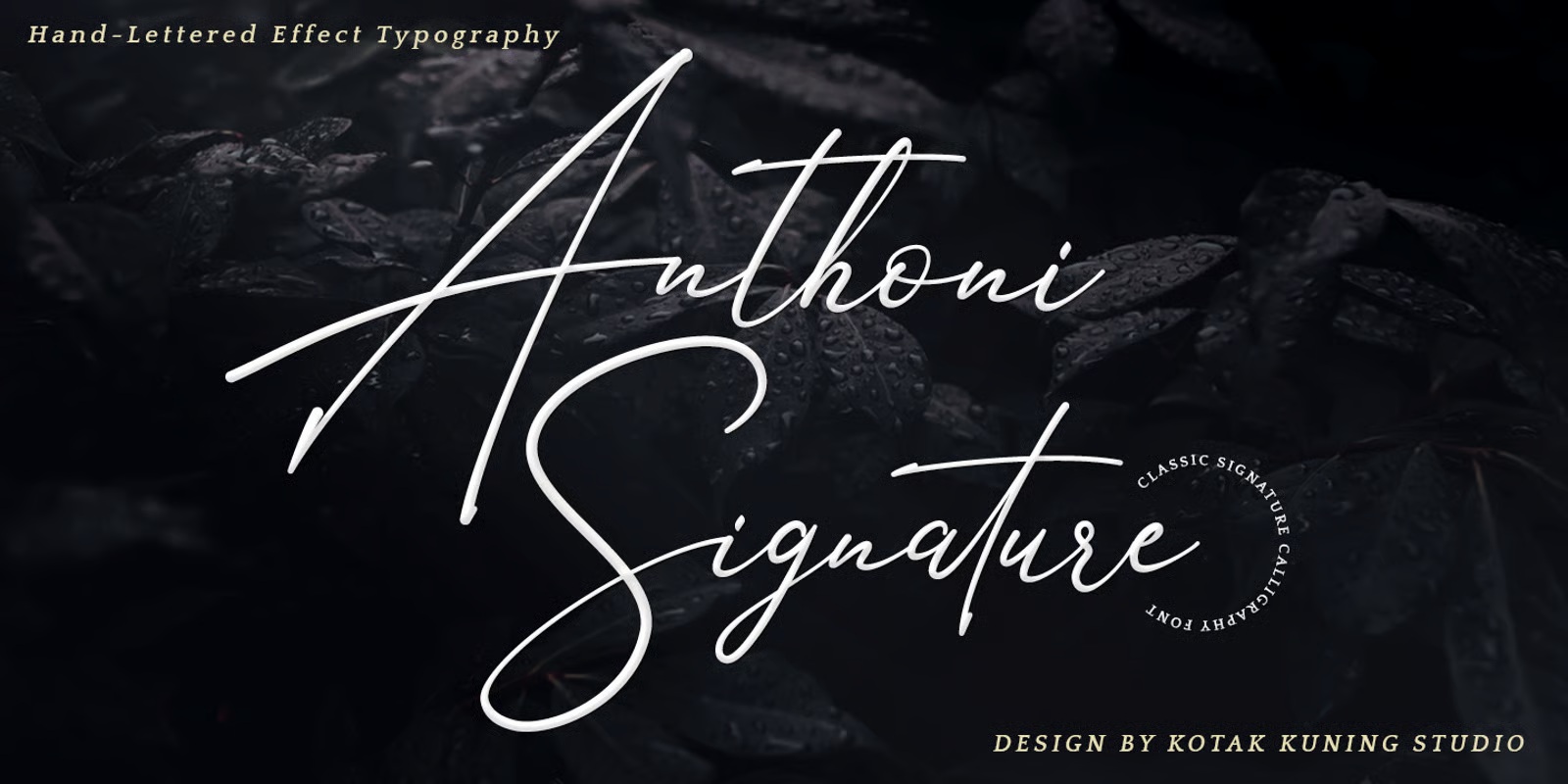
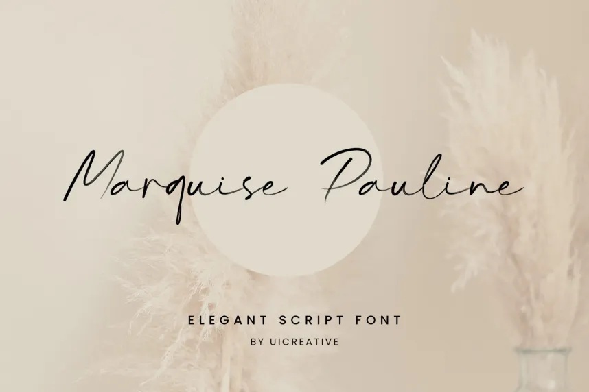
- Famous Examples: Anthoni Script, Marquise Pauline, or casual digital script families. UI Creative and variants.
- The Vibe: Creative, human, and approachable.
- Why It Works for Business: This style is perfect for photographers, consultants, coaches, or independent makers. It breaks the “cold corporate mold” and suggests that there is a real, passionate person standing directly behind the brand.
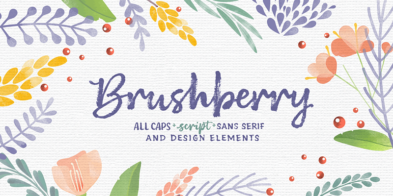
Thick Brush Lettering (For Bold Confidence)
Not all calligraphy has to be delicate. Brush lettering mimics a thick paintbrush dipped in wet ink. The strokes are heavy, textured, and full of energy.
- Famous Examples: Catamount, Hardcover, or heavy textured scripts.
- The Vibe: Youthful, artistic, and confident.
- Why It Works for Web: From a website development standpoint, thick brush scripts are fantastic because they don’t break when scaled down. They keep their shape beautifully whether they are sitting at the top of a giant desktop homepage or squeezed into a tiny icon on a mobile phone app.
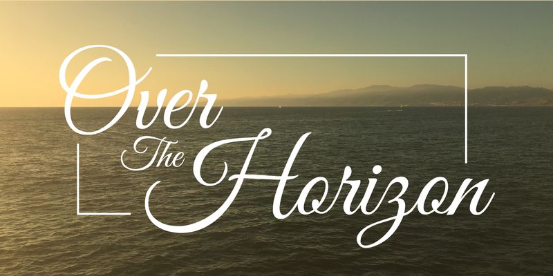
Monoline Scripts (For a Clean, Friendly Vibe)
Unlike traditional calligraphy where the thickness of the line constantly changes, monoline fonts keep the exact same thickness throughout the entire word. It looks like a beautifully continuous wire or a smooth handwriting pen.
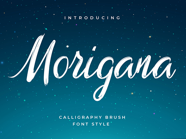
- Famous Examples: Morigana or Sheila.
- The Vibe: Modern, sleek, and welcoming.
- Why It Works for Web: Monoline fonts are incredibly clean. They provide the warmth of human handwriting without any of the messy clutter, making them highly readable across all digital devices.
The Golden Rule: Readability Over Everything
No matter how beautiful a font looks, if a customer cannot read your company’s name at a single glance, the logo has failed.
When your designer creates your logo, always ask to see a “mobile test.” Shrink the logo down to the size of a postage stamp on your phone screen. If the letters blur together or become a mystery to read, pick a simpler variation.
A great strategy is to use the calligraphy font exclusively for your main brand name, and anchor it with a ultra-simple, clean secondary font for your tagline or sub-headings.